Friday, January 18, 2013

Laura Mercier Book of Nudes Swatches, Review and Randomness

It's been forever since I've updated this blog, and although so few people follow it, I like sharing my life with people. Without turning into some sort of public service announcement, please, please, please... don't text and drive. A family member of mine was hit and seriously injured a few months ago and the road to recovery has been a mess. However, I realize this is a beauty blog, and no one wants to hear anything depressing! I popped back into beauty stuff just a bit ago, feeling totally out of it... I feel like I'm playing catch up after reading about all the new products out there like magnetic nail polish and all the holiday sets.

One of the products I purchased lately was Laura Mercier's "Book of Nudes" palette. I freely admit to having a bit of a grudge against Ms. Mercier after an article I read in the New York Times a few years ago, where she was one of a group of French women who basically trashed American women as a whole, saying we all wear too much makeup, are trying to hard to be "visible to attract men", and stereotyped Americans as overdone, glittering Paris Hilton clones. I found it especially hypocritical when I got to the part about Madonna (one of Mercier's longtime clients) is *ahem* forgiven for wearing so much makeup because she is a businesswoman. And Jennier Lopez doesn't count, either, because "she is Hispanic and therefore culturally more exotic". I'm sorry, but... WHATEVER! Not even Catherine Deneuve (who I think is one of the most stunning creatures, ever) was spared. She was bashed for becoming a sort of Dorian Gray character; obsessed with youth, just because she said she loves wearing makeup even when she gardens. To me, that isn't a woman "hooked on youth"; it's just a glamorous, fabulous woman. and just what's wrong with that? But again... whatever! I'm so, so glad makeup artists like Francois Nars and the late (great) Kevyn Aucoin never cared to follow rules about what people should wear, became famous.

Anyway. Onto the review. The Book of Nudes is a palette featuring eight (count 'em, eight!) eyeshadows, one cake eyeliner, a cream bronzer, a cream blush, a cream highlighter, and everything is housed in a really cool, silvery grey faux snakeskin case:


The eyeshadows inside are buff, a matte ivory; Tiger's Eye, a gold-flecked brown; Sandstones, a pale shimmery peachy pink shade; Bamboo, a soft shimmery taupey golden brown; Baroque, a shade that's described as "warm terracotta", but is more of a fleshy brown with golden shimmer on my skin; Fresco, a mauve nude brown; Granite, a matte grey; and Cocoa Brown, a delicious softly shimmered chocolate. Ground Espresso cake eyeliner is a soft black. The consistency of the shadows varies. Almost all of them are pigmented and quite soft. But I had trouble with Tiger's Eye. It's such a shame, too, because it is so beautiful. But really... it was literally a pain in the ass to even swatch, with a difficult texture that reminds me of MAC Veluxe Pearl eyeshadows.

Left to right: Buff, Tiger's Eye, Sandstone


Left to right: Bamboo, Baroque, Fresco
Left to right: Granite, Cocoa Brown, Ground Espresso cake eyeliner

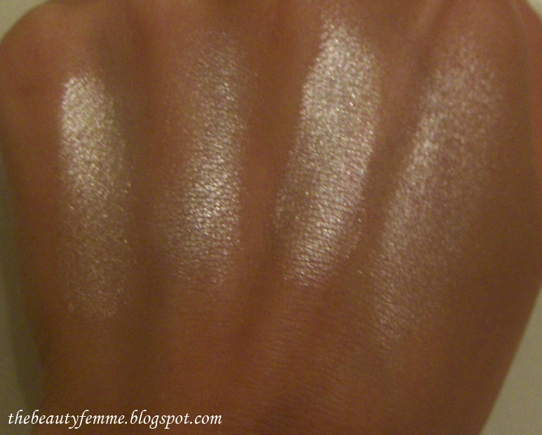
The three Creme Veils in the set are Bronzer Veil, a creme neutral tan; Cheek Veil, a punchy creme peachy pink; and Glow veil, a frosty beige highlighter with a touch of peachy pink:

Left to right: Bronzer Veil, Cheek Veil, Glow Veil

I'm happy with my purchase (lol, even though of Laura Mercier saw me, she would probably tell me I look "vulgaire" ;). Everything in it is high quality; typical of Mercier's cosmetics. I already own Bamboo eye shadow, and the one in the palette is every bit as good as the single. I've used this in a rush on those mornings when you just don't have the time to do a whole complicated Face Of The Day, but you still want to look polished and pretty. The only thing I would warn people about, though, is that everything in the palette is on the warm side. If you're very cool-toned, try it at Sephora or a department store first if you can!

Monday, December 24, 2012

Nails Inc. Magnetic Polish in Houses of Parliament

Happy Turkey Day! In between Thanksgiving chowing down sessions, I have finally gotten around to swatching Nails Inc.'s much talked about Magnetic Polish in Houses of Parliament - a vampy purple spun with silver shimmer. The peel off instructions tell you to pop the top cap off that has the magnetic strip (it's just like a Chanel or Illamasqua polish; the cap pops off and another screw-top cap is underneath), apply one coat, wait a few minutes, apply a generous second coat, and then hold the cap with the magnetic strip over your polish (but don't touch it to the polish). Easy, right?

I actually got this wrong the first time around. I thought you were supposed to apply a second coat to all nails (like you normally do in a manicure) and then start with the magnetic process. No. I looked at the instructions again and this time saw the word "immediately" (d'oh!) after the part about applying a generous second coat. So I started all over again and this was the result: 


The trick to getting this right is really being generous on that second coat. They aren't kidding. Don't skimp on it. Then you hold the magnetic part over the wet polish and voila! It's like magic: these stunning waves appear on the polish, right before your eyes. The only downside of this is that it takes forever to dry, but I'm willing to put up with it for the gorgeous effect. I got compliments on it from just about everyone today, even people who aren't wild about different or funky nails looks. $16 well spent!

Saturday, December 15, 2012

Laura Mercier Baked Eye Colour Palette Holiday Review & Swatches

As we've come to expect, Laura Mercier has released a baked eyeshadow palette for the holidays. This year, it's a collection of five shades in a mirrored compact that range from milk chocolate to baby pink. Since the shadows are baked, you can use them wet or dry, and a mini double-ended brush is included (one side is the eye colour brush, and the other is the creme eye detail brush) that's actually high quality. Not at all like the crappy, sheds-like-a-German-Shepherd mini brushes MAC tends to dump into their holiday kits.

 
The shades are (from left to right):
Sienna - a milk chocolate with shimmer 
Terracotta - shimmering copper-bronze
Ballet Pink -a frosty champange (not really pink at all) along the lines of NARS All About Eve, Stila Kitten, etc
Pink Petal - an icy, shimmery baby pink
Lilac - a beyond gorgeous shimmering lilac

Yeah, yeah... the box says you can use the shades dry, but it's pretty pointless. While Sienna, Terracotta, and Ballet Pink have good pigmentation dry, Pink Petal and Lilac are an enormous let down. And I think that like me, most people will be purchasing this set mainly for those two shade. However, all of the colors look amazing when you apply them wet, when the shadows take on an almost paint-like consistency.

When I went to photograph these, I swatched them in a row in four different ways: dry on bare skin, wet on bare skin, dry over Urban Decay Primer Potion, and wet over UDPP. as we all know, UDPP (or any primer, for that matter) is an eyeshadow game-changer. It can take pretty much the sheerest, most insipid eyeshadow and make it bloom. I found it interesting, and thought I should note that applying these shadows wet over bare skin and dry over UDPP yielded the same result, but for the truest color it was best to apply wet over UDPP. This was especially true for Pink Petal and Lilac. Lilac, whether wet on bare skin or over UDPP on dry skin, had a hint of pink. But when applied wet over UDPP, its bluer tones came through. Pink Petal appeared whitish when applied wet over bare skin or dry over UDPP; when applied wet over UDPP, it shined in all its icy, pure pink glory. I did swatches on both hands, and although I did the ones on my left hand "backwards", I captioned pics to make it easy for everyone, rather than give readers instructions like, "for Sienna and Ballet Pink, it goes like this... ", lol. I also shot them in different lighting for accuracy.

First up is Sienna. I seriously could not believe the difference primer and wet application made in this one:

Right to left: dry over bare skin, wet over bare skin, dry over UDPP, wet over UDPP
Terracotta (hehe, I swatched this after Lilac. you can still see a couple of purple sparkles here and there on my hand):
Left to right: dry over bare skin, wet over bare skin, dry over UDPP, wet over UDPP
Ballet Pink (this one seemed to look pretty much the same no matter how I applied it. And it's NOT pink!):
Right to left: dry over bare skin, wet over bare skin, dry over UDPP, wet over UDPP
Pink Petal (tilt your head slightly to the left for swatch order):
Left to right: dry over bare skin, wet over bare skin, dry over UDPP, wet over UDPP
Left to right: dry over bare skin, wet over bare skin, dry over UDPP, wet over UDP
And last but not least, my favorite of all, Lilac *oohs and ahhs*. you can really see the difference UDPP makes in bringing out the truer blue tones in the second picture, which was taken without flash. It almost looks like I swatched four different shadows:
Left to right: dry over bare skin, wet over bare skin, dry over UDPP, wet over UDPP
 I really like the mix of shades in this palette. You can play with Sienna and Terracotta for a bronzey look; mix Sienna, Ballet Pink and Pink Petal for a pink chocolate look; or just wear Lilac and Pink Petal together for a gorgeous, icy pastel eye that would be perfect for holiday parties (New Year's, anyone? ;)

Wednesday, December 12, 2012

Nails Inc. Special Effects Overglaze Polish in The Wyndham Collection

"Ooh, it looks like a peacock!" 
"Wow. That is really cool...."
"Looks like lime confetti. That's really, really interesting."

Just a few of the compliments I received for Nails Inc. Special Effects Overglaze polish in The Wyndham Collection. I saw this online and just knew I had to get it. Because A) I love all things teal. Teal is second only to purple for me. Blackened teal? Even better. And B) simply put, the clear flaky special effects topcoat is cool, and I really wanted something different for my nails lately. (I've spent the past week in Misa Fashionista, and I was craving something more daring).


So I'm in Sephora with the boyfriend, and I picked this up to purchase because it really was love at first sight. He glanced at it and said, "Wow... that is really cool." (Yes, he is that well-trained. Can you believe it? ;). Here's how Special Effects works: you get two nail polishes in this set, Teal Black Kensington polish and The Wyndham overglaze top coat. Teal Black Kensington is an opaque, slightly jelly-ish (on the first coat) creme. You apply two coats and follow with The Wyndham, which is a clear topcoat/ glaze with handcut, irregular holographic particles that reflect an iridescent green. The end reult is equal parts dazzling and cool. This is my first time trying Nails Inc. polish, and if all of them are as good as Teal Black, I'm in serious trouble. This formula practically applies itself.

Check out Teal Black all on its own below. *Note: I aplogize in advance for the greasy looking hands in these pics. My hands were pretty dry, and the only thing I had lying around was Kiehl's Creme de Corps.


And... drumroll please... here it is with two coats of Special Effects topcoat, in various lighting:


Gorgeous, right?! The Wyndham can look blue-green in certain lights (mainly low), but its holographic effect is predominantly green. You can get by with only one coat, but two really is twice as nice. Once again, I had zero problems with application. I like this set so much, I'm now lusting after The Old Vic Collection!

Tuesday, December 11, 2012

Nicole by OPI K********n Kolor in Smile For The Glam-era Swatch

The title here says it all: K********n is a four-letter word in my home. Actually, worse than a four-letter word, because I have no problems writing or saying a swear word. But I have a strong dislike for fake, self-absorbed "reality" television stars and their antics, and that's all I'll say about it. 

A friend of mine bought me three of these as a surprise from CVS. She purchased Smile For The Glam-era, Paparazzi Don't Peach, and Back to Reality... TV; seeing only a few of them left and knowing that I did nails on my blog (she's also well aware that they are shades I would love!). Smile For The Glam-era is a gorgeous, vampy reddish plum with gold (and I think I see some magenta, too) shimmer throughout. I used two coats and they both went on smoothly. It's time for me to thin my Seche Vite top coat; I spy some shrinkage in this photo! This is a really beautiful shade that's right up my alley:

Friday, December 7, 2012

Chanel Le Vernis in Distraction Swatch

I accidentally cut my finger while cooking late last week, so I gave it a couple days to heal up and get my hands back into good shape for photographing. (Is it really smart of me to do a lot of chopping and cooking when I feature my nails on a blog? D'oh!) In the meantime, I finally got my hands on Chanel Distraction. It was a long wait for it to come to my counters, but in the end it was worth it. This an absolutely BEAUTIFUL, very slightly jelly-ish coral pink with hot pink shimmer. I only had to use two coats to get a nice opaque look, but if you want it to look even richer and brighter (and pinker, at least on my skintone), add a third. It's gorgeous, glossy, and classy... typical Chanel. It can be a little hard to find corals that aren't too electric, but this straddles the line perfectly of being bright enough for a pop of summery color, yet demure enough for those who are a bit color shy. LOVE. Distraction is such a sweet shade- happiness in a bottle!

Thursday, November 29, 2012

L'Oreal Butterfly Kisses Nail Color Swatch

It's finally sunny out today! Yesterday was so grey and dreary, so I couldn't swatch this beauty. Butterfly Kisses is yet another shade out from L'Oreal, one of many from their new Nail Color line. It's a lovely lilac-pink with microshimmer. Very feminine and perfect for spring without being too much of an "Easter egg" or Barbie-ish shade, lol. Something I love about Butterfly Kisses is that it's quite opaque, which is hard (okay, almost impossible) to find in lavenders and lilacs. I used three coats for the swatch below, although most people can probably use only two (I have insane VNL/ visible nail line). This shade is just so pretty and fresh! And it seems to be very similar to Chanel's Lilac Sky, but unfortunately I have gone through the entire bottle I owned of Lilac Sky, so I can't compare them right now: