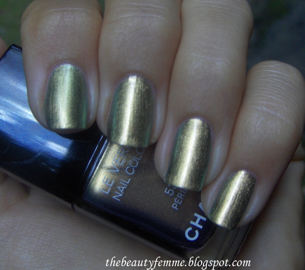
Peridot
is my birthstone (August baby here). As a kid, I disliked it (my two
best friends had aquamarine and amethyst as theirs), but I changed my
opinion of it as I got older and now I think it looks really cool. When
found out Chanel was doing a polish with this name for Fall 2011, I had
to check it out....would it be straight up limey?Chanel's Pé
ridot
is a bit different than the stone. In the bottle it looks like a
duochrome, murky metallic green-gold shade that almost looks like a
shade you'd see in a mood ring- and I swear I'm seeing strong
hints of blue in my bottle. On my nails, it's actually less metallic/
chrome and very shimmery olivey green-gold color. In direct sunlight, it
dazzles and sparkles. In darker/ low/ indoor lighting, it actually just
looks like a straight-up metallic... much less dimensional. It can
almost look like two different colors at times. While I'm not exactly
disappointed, I got spoiled by seeing it in bright sunlight first, in
all it's shimmering glory:
And here's a lower lighting comparison:
I think Pé
ridot looks quite good on my medium skin :)The
other polish Chanel released is Graphite, a rich gunmetal with silver
glitter (Chanel released a third polish for Fall 2011, Quartz, that I am
craving but it's sold out at a few local counters and I'm waiting on a
phone call when they get more). Usually, greys aren't my favorite since
the coolness seems to clash with my warmer skin, but Graphite is
magically neutral enough for me to fall head over heels in love with:
Isn't it cool? What I love about Graphite is that it shimmers and sparkles indoors as well as outdoors, unlike Pé
ridot.
Indoors or in darker lighting, people can tell I'm wearing a glittery
polish- probably partly due to the shimmer in this being chunkier than
the shimmer in Pé
ridot, and also
because of the contrast between the lighter silver glitter over the
darker gunmetal. Many compliments on this one; lots of oohs and aahs.
And I think it'll look even better in the fall and winter months.Apologies
for being on hiatus; I had so many things going on in real life.
Upcoming reviews and pics include Urban Decay's new 24/7 liquid liner (awesome
product, I just had to say it now!), Bobbi Brown's Tortoiseshell Bronze
palette, Sephora for OPI's Make The First Mauve, and L'Oreal Le Gloss
lipgloss
Urban Decay has just released a new set of
nail polishes called "Rollergirl Nail Kit", consisting of six mini
bottles with shades ranging from shimmery taupe to purple glitter. This
is my first time trying Urban Decay polishes (for some reason I always
ignored them), and the kit seemed like a steal at $28 for six nail
polishes.The box is really
cute; it's a little slide-out cardboard tray with floral print on the
front and a superfly 70's rollergirl on the back:
The
colors in the kit are shimmery taupe, heavily shimmered/ glittering
gold, purple glitter, pearly purpley pink, hot pink creme, and white
pearl. Swatches below.Fame:
shimmery taupe. A lot like Urban Decay's Underground Deluxe eyeshadow,
but in a polish. It's a cool twist on usually boring neutrals; this
reminds me of Zoya Pasha but less....complex and more purely taupe:
Superfreak: glittering gold. This literally looks like glittering lamé
on your nails. It's awesome and completely glam. Like a much more awesome, warmer version of Deborah Lippmann's Believe:
Xanadu:
purple glitter. This was sheer on the first coat, surprisingly opaque
on the second, but I added a third for depth and richness:
Miss T: purpley pink with silver pearl. This is a bright, hot color and what I love about it is that it's not too frosty or metallic, which colors like these usually look like. It really pops against a tan:
Woodstock:
hot pink creme. This is as neon as you can get without the
"my-eyes-hurt-from-looking-at-it" quality many neon pinks have. To me
this screams 80's, and doesn't really belong in a 70's rollergirl set,
but it is a gorgeous, fun, and hot color for summer. I got many
compliments on this one:
Love Train:
white pearl. This is very sheer on the first coat, and like Xanadu, is
surprisingly opaque on the second. Love Train is one of the prettiest
and best white pearls I've ever come across (and I love whites and white
pearls). It's a clean, pure white. No silver undertones or flashes of colors like pink or blue. I love it:
The
formula is nice and smooth, the colors are rich and opaque. My only
complaint is that the brush in the bottles are quite long- it's no
biggie, and it makes sense for reaching the bottom when you start going
through these, but it's just a tad awkward for me since I'm used to
shorter ones. Every color in this kit is a winner, the variety of shades
is excellent, and most of all, it's fun. It's just a really fun kit for
summer. I can't recommend it enough.
When I first heard Chanel was releasing a new yellow nail polish for Summer 2011's collection, it made me pause. "Didn't they already do that with the Robertson collection?".
I remembered the much-loved, limited edition lemony shade called L.A.
Sunrise. I never owned L.A. Sunrise, and after seeing the two other
shades Chanel is offering up for this summer, Mimosa was the only one I
walked away with. Morning Rose is a very pretty warm pink with gold
sparkles, but I already own Ming, which looks ridiculously similar on my
hands. And the sheerer-than-an-essie-sheer Beige Pé
tale is a joke, to put it nicely ;)Mimosa
is a bright and cheerful medium yellow with small gold glitter in it.
Honestly, I don't like that about it (I prefer the subtle microshimmer/
perle that Chanel does so well). I have never owned or even worn a
yellow polish, so I thought it would be fun to give it a whirl. Of course, the sales associates kept telling me on and on how fabulous and amazing Mimosa was, but I couldn't help but notice that Morning Rose was the chosen shade for all of their hands and feet. Hmmm.....So
I wore it as a nail of the day. And...I think this is the most
love-it-or-hate-it color I have ever worn in my entire life. A couple of
people saw Mimosa on me and liked it, but the large majority of people
actually winced, turned their heads away, and said things like, "UGH!
What IS that color?!" MIMOSA!
The
formula was nice, and it went on opaque in two coats. But while fun to
try, at the end of the day, Mimosa just isn't me (but it has a happy new
home with a friend of mine :).
Dior
has a really nice summer collection out right now, and part of it
includes two new eyeshadow quints- one is Rosy Nude #534, and the other
is Rosy Tan #754. I purchased Rosy Tan for two reasons: a) my skintone
seemed too dark for the Rosy Nude quint, and b) Rosy Tan seemed to have
the better variety of shades; Rosy Nude looked like five light
"skintone" eyeshadows in comparison, and I just couldn't justify
spending $58 for a quint of all light nude eyeshadows.Rosy
Tan consists of a shimmery ivory-champagne, frosty light pink, satiny
soft taupe, shimmering golden brown, and warm milk chocolate with gold
shimmer:
Swatches. L-R, ivory, pink, taupe, golden brown, chocolate brown:
I was shocked
at how cool and almost lavender-grey the taupe pulls on my skin! In my
experience, Dior's quint shades are a little sneaky- they look one way
in the pan and can turn into another shade on tan skin. The ivory and
pink are typical highlighter shades and versions of them are in almost
every quad and quint on the market.The two brown colors looked dupeable
once I got to playing with this at home, and I was sure they were too
similar to ones I already had. When I compared them to my other shadows,
however, they were a bit more unique than I thought. I
compared the taupe shade to (left to right) MAC Satin Taupe (look at
how lavender it looks compared to ST!), Make Up for Ever eyeshadow in
127, and Laura Mercier Bamboo eyeshadow. The Dior taupe is second from
left:
I
compared the golden brown to a few others I thought might be close,
including MAC Sable (far left), MAC Woodwinked (second from right), and
MAC Tempting (far right). Again, no matches. (I have no idea why I
didn't compare it to Laura Mercier Bamboo- it might be the closest to
it).
And
finally, I swatched the milk chocolate shade alongside Milani Java Bean
(far left), Urban Decay Twice Baked (second from right), and MAC Mulch
(far right). No matches, yet again. My eyes tricked me by thinking they
were so ordinary.
Rosy
Tan's shades are all nicely pigmented, with good blendability and a
silky texture. This will be lusted after by brown eye makeup lovers, but
it would make a nice addition to almost anyone's stash since the colors
look great year-round.
I don't really like makeup primers. Apart
from the ones made for eyeshadows, they seem like an unnecessary step in
my makeup routine. Yet I try them all the time, giving in whenever I
hear or read about them from make up artists or in beauty mags. They're
stressed as a vital part of makeup application, and parallels are drawn
between an artist's canvas and your face: "both need to be primed before you can begin to paint." You know. Stuff like that ;)NARS
recently released two face primers- both named "Pro-Prime". One is
oil-free and refines pores, and the other contains sunscreen (SPF 30 to
be exact) and antioxidants. Both retail for $32. I picked up the Pore
Refining Primer and have been using it for a week now. It's oil-free,
alcohol-free, paraben-free, synthetic-fragrance free, non-comedogenic,
non-allergenic, and dermatologist tested. Pure lentil seed extract
"diminishes the appearance of dilated pores over time for a more refined
appearance". Mineral powders "manage oil in the t-zone and other
shine-prone areas while blurring the look of pores, fine lines, and
wrinkles". The bottle is quite small, but a little really does go a long
way with this. It has an ultra-light, watery gel consistency (which I love)
and a light herbal scent. It blends into skin nicely and leaves a
velvety matte, but not tight or dry, finish. When tested under various
foundations, MAC Select Tint tinted moisturizer, and even just powder
and concealer, it performed well under all of them; extending makeup
wear, keeping shine at bay for hours, and giving skin an almost
soft-focus finish. It's a winner!


For
reference, primers I've tried in the past include Laura Mercier
oil-free primer (which didn't seem to be for oily/ acne prone skin at
all- it was so greasy and broke me out), Smashbox Photo Finish (broke me
out) and Photo Finish Light (I disliked the silicone feel of this, but
it was my favorite), Urban Decay Pore Perfecting Primer Potion (which
has the consistency of glue), MAC Prep + Prime Skin (this was ok. Not as
much of a silicone feel as some others, but it messed up my skin),
L'oreal Studio Secrets Magic Perfecting Base (good, but not very
spreadable and tends to pill up on my skin), Monistat Chafing Gel
(didn't work on my combo skin), and Clinique's Pore Minimizer Instant
Perfector (did nothing!). I haven't tried any of Make Up For Ever's yet, which do get positive reviews.
"Urban
Ballerina" is Sephora by OPI's newest collection for Spring 2011. I
picked up the Urban Ballerinas mini set to try out, which consists of
four tiny (and they are tiny! They were pretty hard to hold onto
in photographs) bottles: Leotard Optional, The Way Tutu His Heart, Who's
Spinning Tonight?, and Break A Leg-Warmer! I
usually love Sephora by OPI polishes, but the formula on these were a
bit of a let down (is it because they're minis? This is my first time
buying minis). Thin, watery, and two were streaky.Leotard Optional
is an opaque, very pretty neutral cafe latte creme. The formula was
pretty good on this one, albeit a little thick and somewhat streaky (I
used three coats for this picture). It looks warmer in the bottle than
it did on my hands, where it seemed to magically become pinker. This
reminds me a bit of OPI's Kreme de la Kremlin, but not as rosy. It's a
nice, work appropriate neutral:
The Way Tutu His Heart
is a very pale semi-opaque whitish pink. So many people are always
after the nail polish color Giada de Laurentiis often wears; a creamy
pinky white that looks like really clean nails (it's
been said that OPI Bubble Bath is it, but BB didn't look anything like
it at all on me). When I saw this in the bottle, I thought it just might
be that color on me. While this is a very pretty version
of that shade, the formula is difficult: streaky as hell! I needed three
coats. Opaque pale pinks are pretty much always hard to work with,
however, so I just may suck it up and end up buying the full size (I'd
also like to compare the formula of a mini to the full size version's,
just to see if there is any difference). Especially since most opaque
pale white pinks are too pastel. This one looks natural in comparison to
those:
Who's Spinning Tonight? is
a warm purple with magenta and blue sparkles. Really cool,
but....again, the formula was just "eh": extremely thin and watery on
the first coat, better on the second but streaky, and the third covered
up all previous sins:
Break A Leg-Warmer!
is a grey creme with strong blue undertones. Not my favorite on myself,
but still a very cool shade. The first coat was very watery and thin.
The second coat went on evenly, however, so I only had to use two coats:
There
are two other shades that are part of the Urban Ballerina collection
which are not included in this set: Shiny Dancer (a metallic slate
grey), and Let's Plie (a metallic beige- which I really want to try
since I love shimmery nudes).
Chanel released a new lipstick recently; a
shiny, sheerer version of their already popular Rouge Coco. The
appropriately named Rouge Coco Shine lipsticks are housed in slim
versions of the classic Chanel/ RC tube (black and gold) and retail for
$32 (crazy, I know, but it seems there's a sort of war going on with
high-end makeup companies to see just who can make the priciest and most
luxurious lipstick).I
purchased Biarritz and Cavalière after playing around with the testers
at the display (although I wanted a few more, to be honest ;). Biarritz
is a gorgeous soft natural peach with golden microshimmer, and Cavalière is a beautiful "my-lips-but-better" shade of shimmering mauvey plum that is very similar to Dior's famous Addict lipstick in Chestnut Chic, only much, much better in my opinion. While Cavalière
looks very cool-toned in the tube, on my lips it turns into one of the
most gorgeous and flattering MLBB shades I have ever worn. Biarritz:
Cavalière:
Swatches (Cavalière on the left and Biarritz on the right):
The
shimmer in these two shades is extremely fine and hardly noticeable
once on lips; nothing frosty or even remotely disco ball. The formula is
to die for. As smooth as butter, cushiony, and super hydrating,
these almost feel like liquid on your lips and leave behind a soft
shine. Although they are soft and glossy, I didn't experience any
bleeding with these lipsticks.While
I think $32 is a ridiculous/ borderline hilarious price for a lipstick,
these are definately worth it. The only thing that might deter anyone
from buying is if you are sensitive to scent: they have the somewhat
heavy Rouge Coco floral scent (a mix of rose and vanilla), but I
honestly don't notice on my lips. And I am concerned about how these
will fare in even slightly warm weather- they're so soft, I fear they'll
melt in no time flat.The other shades (of the 18 available) that caught my eye were Liberté
, a peach-coral; Unique, a strawberry pinky-red shade which looked like a lipstick version of Spark Glossimer; and É
vasion,
a pale pink-peach. The sales associate tried to sell me on Boy, a pinky
mauve that is the most popular shade right now, but it looked too cool
for my NC40-ish coloring.