Thursday, July 26, 2012

Bobbi Brown Rose Gold Shimmer Brick Review and Swatch

Bobbi Brown's Spring 2012 Collection is so, so pretty. It's the "Rose Gold" Collection, and it's classic Bobbi: flushed cheeks, gently lined eyes, and lush lips, in shades of golden pinks and rose. I am a huge fan of all things rose gold, and since I've been wanting more highlighters lately, I ordered the Rose Gold Shimmerbrick. It's your typical shimmerbrick highlighter, only this time the shades are pale pink, beige champagne, a warm lilac-ish pink, pale bronze, and rose gold. (I think this was the most impossible item to photograph accurately, since it's so reflective. It's because of the high shimmer. It took me days to get a decent one! Seriously.)


                   They blend together to make a frosty, light pink highlighter:


I found that when the strips of colors were used individually, they really weren't all that different, at least on my skin. It was all just varying shades of pink frostiness.... sadly, a lot of rose, and not enough gold for me. The quality is wonderful, as always with Bobbi's Shimmer Bricks. However, after playing around with it, I realize that I could have just saved my money and continued to use the MSFs I have from MAC's Brunette, Blonde, Redhead collection. Ack... I think I was just too tempted by the beautiful shade name of "Rose Gold"!

Sunday, July 15, 2012

Yves Saint Laurent Manicure Couture Colour Nail Polish Duo - Edition 7

I saw these cool new nail polish duos by Yves Saint Laurent the other day at Bloomingdale's. You get two mini nail polishes that are a pretty good size for $30; they aren't as small as OPI or Sephora by OPI minis. And there are two duos to choose from: Edition 7 (mint green and chocolate brown), and Edition 8 (bubble gum pink and tangerine orange). Honestly, I am SO sick of the stereotypical flamingo pinks and Sunkist oranges we're dished out every spring and summer (it's just so predictable, and at this point I'm always wondering, "haven't I seen this exact color a million times by now?" when I lay my eyes on them). Going home with Edition 7 was a no-brainer.

The mint green is a vibrant medium mint with lime green microshimmer, and I think it definately has the look of a Chanel nail polish (it's all in the subtle shimmer). If you love greens, you will probably buy this duo just for this shade:


The chocolate brown is a neutral-cool chocolately creme. It almost appears to have a tinge of purple from time to time, depending on the lighting, but mostly it just looks like hot fudge sauce (YUM):


I found the formula on these to be a bit streaky, but it wasn't too bad. I did three coats for both pictures, although you could get away with two (however, the green looks even better with three ;). I really didn't like the brush, and I think the streakiness I experienced was due to that rather than the formula. It's a shorter brush with a sharp diagonal cut, and I found that even though it did spread out evenly when you applied pressure, the shape of it goes against the natural shape of the cuticle:


It's a bit of an uphill battle. I found this to be especially true with the brown shade, which not only had a sharper angle than the brush in the mint green bottle, but the bristles were uneven (....um....hello, quality control!). If you look closely, you can see in the pictures that the green shade is so nice and smooth around the cuticle, while the brown shade looks a bit messier. All in all, however, this is a very nice (and more importantly, unexpected!) item for spring 2012.

Monday, July 9, 2012

Givenchy Vernis Please! Nail Lacquer in 175 Acid Orange

I've never tried Givenchy nail polish before this shade. But I'm a sucker for oranges and new products, so lo and behold it ended up in my stash. With the name "Acid Orange", I was certain this would be a neon. Or at least verge on neon territory. It's not (which is not necessarily a bad thing!). Instead it's a glossy, creamy bright orange that's more yellow-orange than red, with a smooth formula that was opaque but not thick at all. I'm impressed (and of course, looking forward to trying more colors)!:


 I love this so much more than Chanel's Mimosa ;)

Sunday, July 8, 2012

Fresh-Squeezed Brights Spam :)

Just some pics of happy, juicy bright shades for summer.

Sally Hansen Kook-a-Mango. Yummy corally goodness- and just two coats:

  
Essie Meet Me At Sunset: Orangey-red creme. Finally! I have been looking for this shade of orangey red forever! Almost all reds turn cooler on my skin than in the bottle, and orangey red corals tend to go pinkish or reddish. Not here :) Again, two coats:


The previously posted Givenchy Acid Orange:


Chanel Mimosa. Yellow happiness (hehe...if it works for you better than it did me ;) Although this has grown on me. Or maybe I've just been really forceful about getting others to like it :p


Illamasqua Radium. This shade makes me want to drink Sprite...or a mojito. Released awhile ago and already shown by pretty much every blogger on the 'net, but here's my pic. This is two coats, and it looks really glowy on my skin indoors- a very slight glow-in-the-dark look. I'm not sure if it's the particular shade of lime or the shimmer, or both. Either way, it's cool :)

Friday, July 6, 2012

Chanel Nail Colour in April - Swatch

I'm really late to the party in swatching this beauty, but I wanted to put up the pic anyway since April is so gorgeous. April is part of the spring 2012 collection, and it's a permanent addition to Chanel's Le Vernis lineup. The color is a sort of hybrid of red and purple; in my opinion, the color can be best described as a neutral reddish berry creme with a bit of a muted/ dusky quality. The formula is very smooth and not too thick; application was a breeze and I used two coats for the picture below. A third is completely unnecessary. I got SO many compliments on this, it's insane! And it looks just stunning against golden skintones. My new favorite color!:

Sunday, June 24, 2012

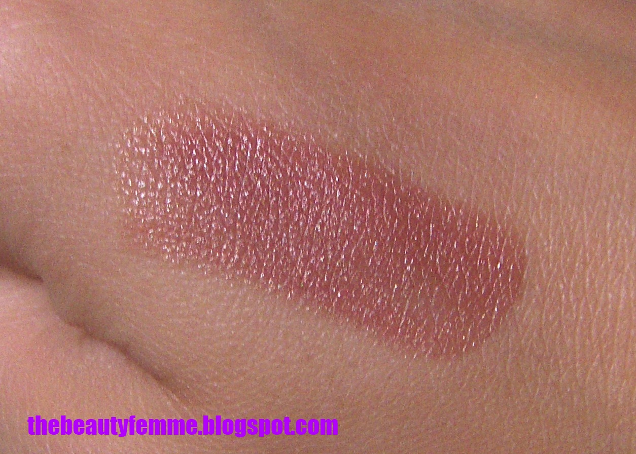
Nars Bilbao Lipstick Review and Swatch

I'm fooling around with fonts today, and now many of my posts are just screwed up. Ugh. Everything else was equally frustrating, so when the FedEx guy dropped off NARS Bilbao lipstick, I'm not exaggerating when I say that it was the highlight of my day.

Bilbao was makeup love at first sight. While it may seem like a dime-a-dozen pinkish nude brown shade that's exactly like hundreds of others on the market, Bilbao is without a doubt the most flattering, beautiful, "where-have-you-been-all-my-life?" neutral I have ever worn (and I usually don't get too excited about neutrals!). It pulls pinker on lips than it looks in the tube, and the hint of golden shimmer keeps it from looking flat. I love it SO much more than MAC Viva Glam V, which has a strong reddish tone on my lips. This is a Satin lipstick from NARS, but it looks just a bit closer to a satin-matte because of its low sheen when worn on bare lips. Bilbao wore evenly for hours without a touch-up. What else is there to say? This is easily my best purchase in a long time.

Wednesday, June 20, 2012

Too Faced Natural Face Natural Radiance Face Palette Review and Swatches

Do you love contouring and highlighting as much as I do? It's like real-life Photoshop. Ever since I was a preteen and saw Kevyn Aucoin contour his sister's face in his "Making Faces" book, I've been fascinated by it. I don't do a full-on contour and highlight everyday, since my face is quite bony to being with. I sweep a little bit of MAC Shadester under my cheekbones and then dab on a bit of highlighter over it, adding a bit under the arch of my brows. Too much heavy contouring makes me look like RuPaul at best and Skeletor at worst, but when done correctly, it's truly amazing for photos. Too Faced has released a new face palette that has everything you need to do different levels of contouring, whether you want a full-on supermodel look or just a bit of an extra glow. It's one-stop shopping for a contour lover: a powder bronzer, powder blush, creme blush, concealer, luminizer, and brightener. 


Here's the how-to card with instructions for doing three different styles of sculpted faces:


The palette is just beautiful! A dream come true, right?

Wrong. The bronzer is so light, it's a joke. I had to swatch it VERY heavily to get any sort of payoff. I don't see this working on anyone except fair-skinned ladies, and even then it has a strange sort of yellow tone to it (cool-toned lovelies will likely be pissed off, lol). The creme blush is a lovely fleshy neutral pink with a great creamy texture, but alas, it's just a bit too light for me. The powder blush is a frosty light peachy-pinky-coral shade with great pigmentation that I'm sure we've all seen many times before, but that's ok, because it flatters so many. The Luminizer is a frosty pinkish champagne, and the brightener is a yellowish cream tone. The Concealer is sort of a standard "light" skintone shade, and it's pinker than the Brightener. It looks even pinker when swatched on my arm. Here are the swatches:

L-R: Bronzer, Creme blush, Powder Blush. Top to bottom: Concealer, Luminizer, Brightener

Here's another shot of (L-R) the Concealer, Luminizer and Brightener. Just way too light for me:

Skintone Match Fail

Man.... I really wanted to love this! There's nothing in the world more convenient than palettes, but this was such a let down. I guess I can sum it up simply by saying this is yet another One-Shade-Fits-All kit. And for myself and anyone darker, that means it's a fail. If you have the skintone to pull this off, not only will look amazing on you, you'll have lots to play with for $39. I'm cranky because this is yet another time when darker skintones have been shafted by a makeup company. Come on, Too Faced! At least release "Light/ Medium" and "Medium/ Dark" versions to make a little more fair.