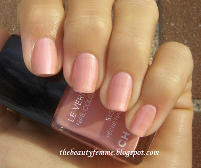
Pê
che Nacré
e
is one of two nail polishes I purchased from Chanel's Spring 2011
collection (Black Pearl was unfortunately sold out). It's a soft, work
appropriate peachy pink with a very soft pearl. The application was nice
and smooth, and I only had to use two coats for full coverage:
I always love colors like this since they are feminine and work nicely with my skintone, but Pê
che Nacré
e
left me underwhelmed. It looks quite "Tinkerbell" on my skin, and it
seems entirely too dupeable to be worth the price of $23. I
have a couple of peachy/ pinks in my stash, and the two closest dupes
that came to mind were Zoya Willow and OPI My Daddy's The King!. Willow
is a much more orangey (true) peach with silver shimmer, while My
Daddy's The King! is a bit paler (with less of a pink tone), but quite
close (and prettier, if I do say so myself) on the nail. MAC Coconut Ice
(d/c) from the MAC in Lillyland collection seemed to be a similar
peachy pink, but it ended up being too bright and coral pink, and it
lacked the pearliness in Pê
che Nacré
e. OPI Dancing the Isles is a peach pink, but it's deeper, way too Barbie, and has a ton of frost.
My Daddy's The King! is clearly closer to being a dupe than the Willow, and even though it is not one, I think it's a much better bet since Pê
che Nacré
e
overall isn't all that special (and MDTK! actually looks more
expensive). Sure, she's nice to look at, but in the end she just isn't
worth it ;)
Bobbi
Brown's Spring 2012 Collection is so, so pretty. It's the "Rose Gold"
Collection, and it's classic Bobbi: flushed cheeks, gently lined eyes,
and lush lips, in shades of golden pinks and rose. I am a huge
fan of all things rose gold, and since I've been wanting more
highlighters lately, I ordered the Rose Gold Shimmerbrick. It's your
typical shimmerbrick highlighter, only this time the shades are pale
pink, beige champagne, a warm lilac-ish pink, pale bronze, and rose
gold. (I think this was the most impossible item to photograph
accurately, since it's so reflective. It's because of the high shimmer.
It took me days to get a decent one! Seriously.)
They blend together to make a frosty, light pink highlighter:
I
found that when the strips of colors were used individually, they
really weren't all that different, at least on my skin. It was all just
varying shades of pink frostiness.... sadly, a lot of rose, and not
enough gold for me. The quality is wonderful, as always with Bobbi's
Shimmer Bricks. However, after playing around with it, I realize that I
could have just saved my money and continued to use the MSFs I have from
MAC's Brunette, Blonde, Redhead collection. Ack... I think I was just
too tempted by the beautiful shade name of "Rose Gold"!
I saw these cool new nail polish duos by Yves Saint Laurent the other day at Bloomingdale's. You get two mini nail polishes that are a pretty good size for $30; they aren't as small as OPI or Sephora by OPI minis. And
there are two duos to choose from: Edition 7 (mint green and chocolate
brown), and Edition 8 (bubble gum pink and tangerine orange). Honestly, I
am SO sick of the stereotypical flamingo pinks and Sunkist oranges
we're dished out every spring and summer (it's just so predictable, and
at this point I'm always wondering, "haven't I seen this exact color a million times by now?" when I lay my eyes on them). Going home with Edition 7 was a no-brainer.The
mint green is a vibrant medium mint with lime green microshimmer, and I
think it definately has the look of a Chanel nail polish (it's all in
the subtle shimmer). If you love greens, you will probably buy this duo
just for this shade:
The
chocolate brown is a neutral-cool chocolately creme. It almost appears
to have a tinge of purple from time to time, depending on the lighting,
but mostly it just looks like hot fudge sauce (YUM):
I
found the formula on these to be a bit streaky, but it wasn't too bad. I
did three coats for both pictures, although you could get away with two
(however, the green looks even better with three ;). I really
didn't like the brush, and I think the streakiness I experienced was due
to that rather than the formula. It's a shorter brush with a sharp
diagonal cut, and I found that even though it did spread out evenly when
you applied pressure, the shape of it goes against the natural shape of
the cuticle:
It's
a bit of an uphill battle. I found this to be especially true with the
brown shade, which not only had a sharper angle than the brush in the
mint green bottle, but the bristles were uneven (....um....hello,
quality control!). If you look closely, you can see in the pictures that
the green shade is so nice and smooth around the cuticle, while the
brown shade looks a bit messier. All in all, however, this is a very
nice (and more importantly, unexpected!) item for spring 2012.
I've
never tried Givenchy nail polish before this shade. But I'm a sucker
for oranges and new products, so lo and behold it ended up in my stash.
With the name "Acid Orange", I was certain this would be a neon. Or at
least verge on neon territory. It's not (which is not necessarily a bad
thing!). Instead it's a glossy, creamy bright orange that's more
yellow-orange than red, with a smooth formula that was opaque but not
thick at all. I'm impressed (and of course, looking forward to trying
more colors)!:
I love this so much more than Chanel's Mimosa ;)
Just some pics of happy, juicy bright shades for summer. Sally Hansen Kook-a-Mango. Yummy corally goodness- and just two coats:
Essie
Meet Me At Sunset: Orangey-red creme. Finally! I have been looking for
this shade of orangey red forever! Almost all reds turn cooler on my
skin than in the bottle, and orangey red corals tend to go pinkish or
reddish. Not here :) Again, two coats:
The previously posted Givenchy Acid Orange:
Chanel
Mimosa. Yellow happiness (hehe...if it works for you better than it did
me ;) Although this has grown on me. Or maybe I've just been really
forceful about getting others to like it :p
Illamasqua Radium. This shade makes me want to drink Sprite...or a mojito.
Released awhile ago and already shown by pretty much every blogger on
the 'net, but here's my pic. This is two coats, and it looks really
glowy on my skin indoors- a very slight glow-in-the-dark look. I'm not
sure if it's the particular shade of lime or the shimmer, or both.
Either way, it's cool :)
I'm really late to the party in swatching this beauty, but I wanted to put up the pic anyway since April is so
gorgeous. April is part of the spring 2012 collection, and it's a
permanent addition to Chanel's Le Vernis lineup. The color is a sort of
hybrid of red and purple; in my opinion, the color can be best described
as a neutral reddish berry creme with a bit of a muted/ dusky quality.
The formula is very smooth and not too thick; application was a breeze
and I used two coats for the picture below. A third is completely
unnecessary. I got SO many compliments on this, it's insane! And it
looks just stunning against golden skintones. My new favorite color!: